A plain-English guide to shadcn/ui — the component collection that gives you professionally designed buttons, forms, dialogs, and more that you actually own and can customize.
If you have ever tried to build a web application, you have probably faced this dilemma: do you spend weeks designing every button, form, and dialog from scratch, or do you use a pre-built component library and accept that your product will look like everyone else's?
shadcn/ui offers a third option — and it is the one this template uses.
Imagine opening a restaurant. You could forge your own pots and pans, weave your own tablecloths, and carve your own furniture. The result would be completely unique, but you would never actually open the restaurant.
Building interface components from scratch is similar. A single "date picker" — the calendar widget that lets users select a date — can take weeks to build properly when you account for keyboard navigation, screen reader support, different date formats, mobile behavior, and edge cases. Multiply that by every component your application needs (buttons, dialogs, dropdown menus, form inputs, navigation bars, toast notifications), and you are looking at months of work before you build any actual features.
The alternative has been to use a component library like Material UI or Bootstrap. These give you ready-made components, but they come with trade-offs:
It is like buying pre-made furniture for your restaurant. It gets you open faster, but the dining room looks exactly like every other restaurant that bought from the same catalog, and you cannot easily modify the tables to fit your space.
shadcn/ui takes a fundamentally different approach. Instead of installing a library as a dependency, you copy the component code directly into your project. The code becomes yours — part of your codebase, under your control, fully customizable.
Here is the key difference:
| Aspect | Traditional Library | shadcn/ui |
|---|---|---|
| Installation | Installed as a dependency you cannot edit | Copied into your project as editable code |
| Ownership | Owned by the library maintainers | Owned by you |
| Customization | Override styles, fight defaults | Edit the code directly |
| Updates | Automatic (can break your customizations) | You choose when and what to update |
| Bundle size | Entire library included | Only the components you actually use |
Think of it this way: a traditional component library is like renting furniture. shadcn/ui is like buying the blueprints and materials, then building furniture that fits your exact space. You start with a professional design, but you own the result and can modify it however you want.
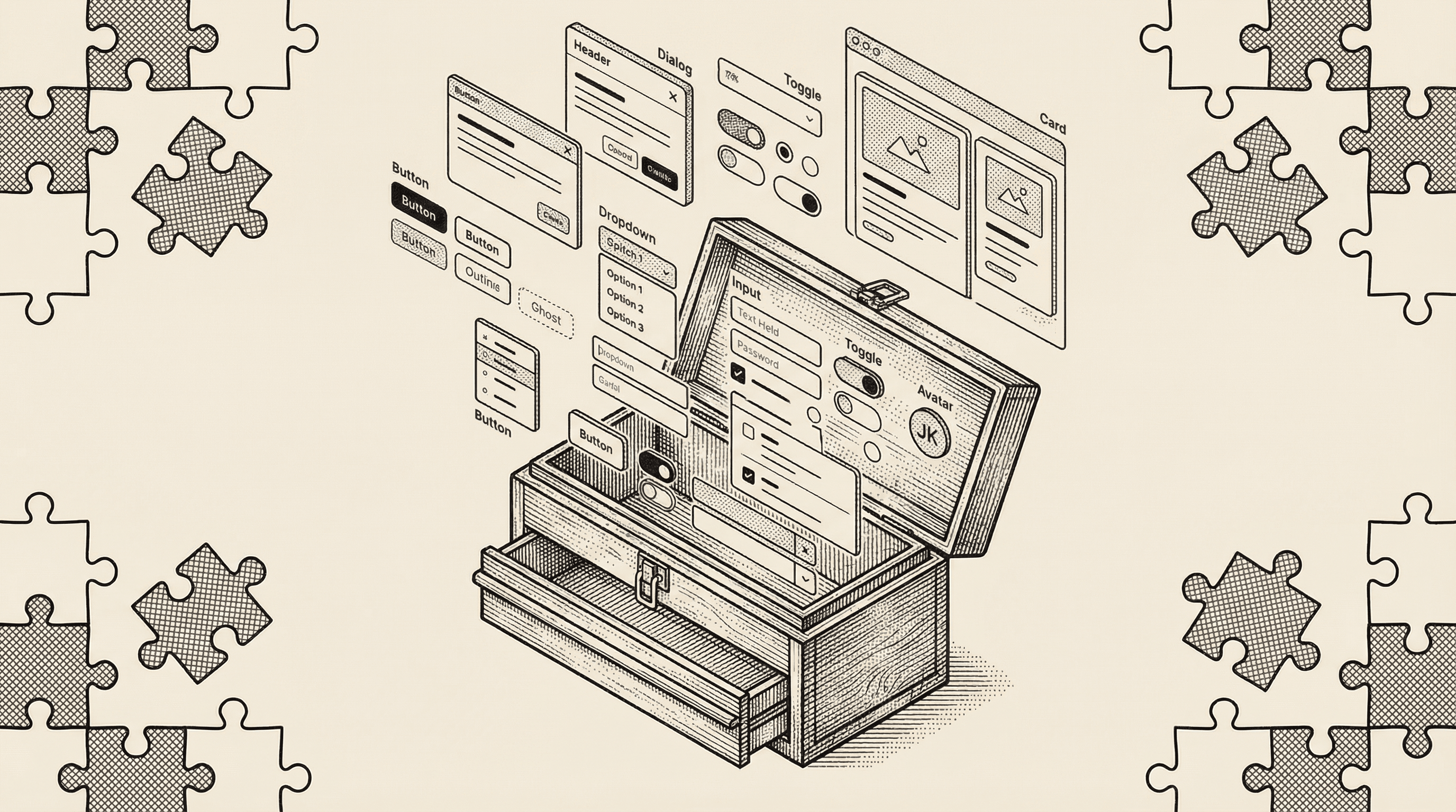
shadcn/ui provides dozens of professionally designed components. Here are some of the most common ones:
Basic elements:
Form components:
Overlay components:
Layout and navigation:
Each component is designed to look polished out of the box while being straightforward to customize.
shadcn/ui is built on two important foundations:
Under the hood, many shadcn/ui components use Radix UI — a library of "headless" components. Headless means they handle all the complex behavior (keyboard navigation, screen reader announcements, focus management, click-outside-to-close) without providing any visual design.
Think of Radix UI as the mechanical parts of a car — the engine, transmission, and steering system. They handle the complex engineering, but they do not decide what the car looks like.
This is why shadcn/ui components work correctly for everyone, including people who:
Accessibility is built into the foundation, not bolted on as an afterthought.
All visual styling in shadcn/ui is done with Tailwind CSS — the same utility-first styling framework used throughout this template. This means:
Because both your custom code and your shadcn/ui components speak the same visual language (Tailwind), everything looks cohesive without extra effort.
In this template, shadcn/ui components live in the components/ui/ folder. When you open that folder, you will see files like button.tsx, avatar.tsx, and others. These are not mysterious black boxes — they are readable, editable code files.
For example, the Button component defines several variants — pre-configured visual styles for different purposes:
Using a component in your application is straightforward. You import it and use it like any other element, choosing the variant and size that fits your need.
You might be thinking: "I just want to build my product. Why do I need to know about component libraries?"
Here is why it matters:
Professional quality from day one. Every component in this template has been designed by professionals and tested for accessibility. Your product looks polished before you write a single line of custom code.
Consistency without effort. Because all components use the same design tokens, your buttons, forms, cards, and navigation all look like they belong together. There is no accidental mismatch between your signup form and your settings page.
Speed without sacrifice. You do not have to choose between building fast and building well. The components give you a head start without locking you into a design you cannot change.
Full ownership. As your product grows and your design evolves, you can modify any component to match your vision. There is no "ejecting" from a framework or fighting against built-in styles. The code is already yours.
Because shadcn/ui components are styled with Tailwind CSS and use design tokens defined in your globals.css file, changing the look of your entire application can be as simple as updating a few token values.
Want to change the primary color of every button, link, and accent element? Update the color token in one place and the change cascades through every component automatically. Want rounder corners on all your cards and dialogs? Adjust the border radius token.
This is the power of a token-based design system — you make decisions at the system level, and every component follows.
components/ui/ and is readable, editable code — not a locked dependency.globals.css) so you can change the look of your entire application from a single file.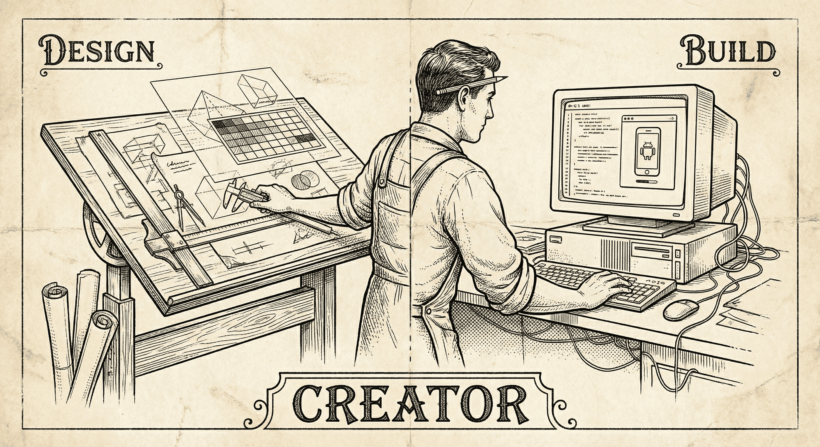
Designers have the taste, the empathy, and the vision. The missing piece is often the ability to ship. Here is why building — not just designing — is the next step, and how to start.
It is not easy, but if you learn these ten simple things before you build, you will be ahead of most first-time builders and avoid the worst pitfalls.