Master the four pillars of visual design — typography, color, spacing, and layout — to create an application that looks polished and trustworthy without hiring a designer.
First impressions matter. Research shows that people form an opinion about a website in about fifty milliseconds — before they have read a single word. A professional-looking application builds trust, credibility, and confidence. A sloppy one drives people away.
The good news is that making something look professional is not about artistic talent. It is about understanding and applying a few fundamental principles. This template gives you a strong foundation — this guide teaches you how to maintain and extend it.
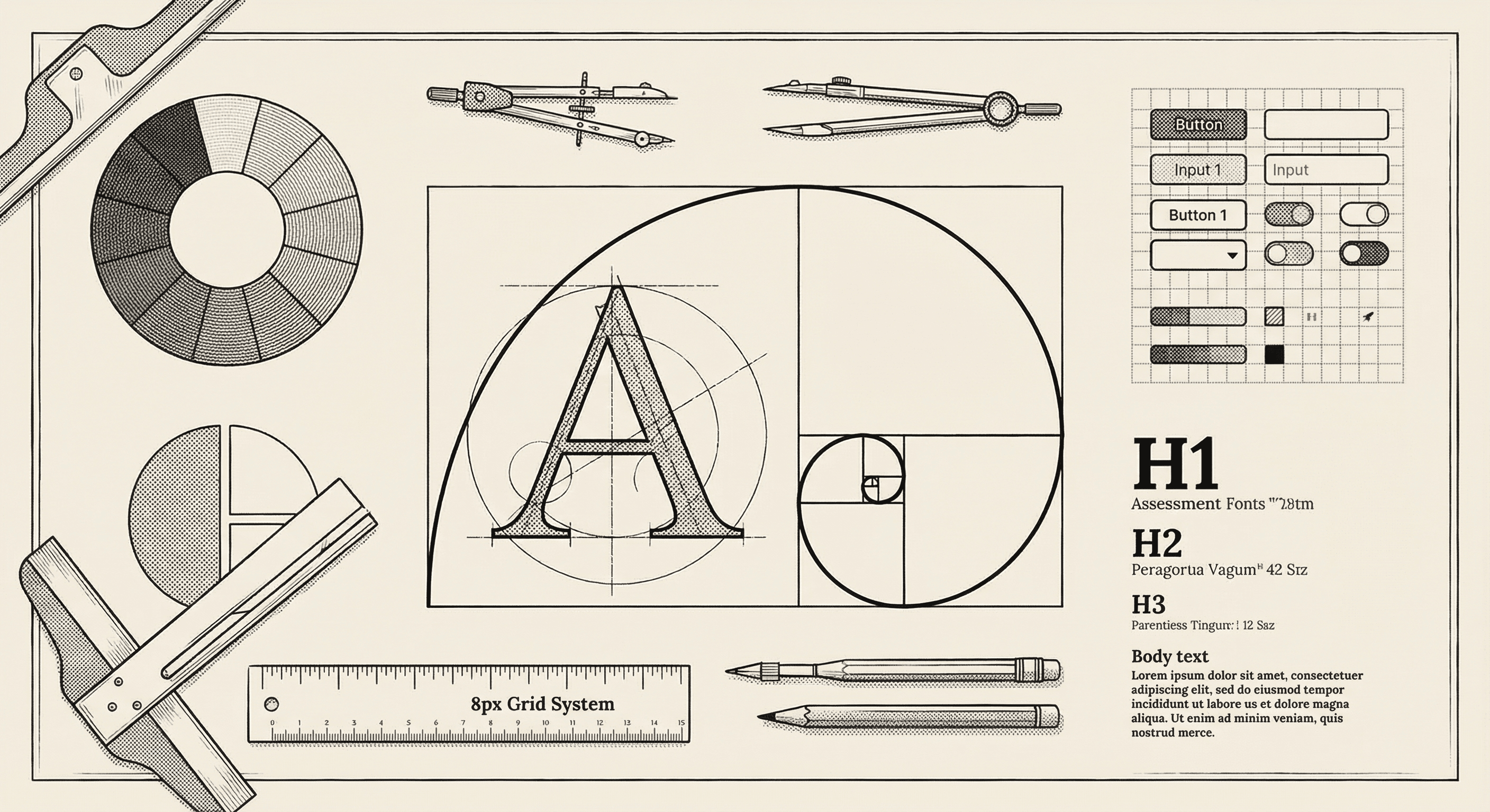
Every well-designed interface rests on four pillars: typography, color, spacing, and layout. Master these, and your application will look like it was designed by a professional.
Typography is the art of arranging text. Since your application is made primarily of text — headings, paragraphs, labels, buttons, navigation — typography has an outsized impact on how professional it looks.
Your text needs a clear visual hierarchy — a system that tells people what is most important, what is secondary, and what is supplementary. You create hierarchy through:
A good hierarchy typically includes:
| Role | Size | Weight | Usage |
|---|---|---|---|
| Page title | 2xl to 4xl | Bold | One per page, the main heading |
| Section heading | xl to 2xl | Semibold | Divides the page into sections |
| Subsection heading | lg to xl | Medium | Groups content within sections |
| Body text | base | Normal | The primary reading text |
| Small text | sm | Normal | Metadata, captions, timestamps |
Lines that are too long are hard to read — your eye loses its place when returning to the next line. Lines that are too short cause too much eye movement.
The ideal line length for body text is 50 to 75 characters per line. This template's max-w-3xl and max-w-4xl containers achieve this naturally.
The space between lines of text affects readability significantly. Too tight, and lines blend together. Too loose, and the text feels disconnected.
For body text, a line height of 1.5 to 1.75 times the font size is comfortable for reading. Headings can use tighter line heights (1.1 to 1.3) because they are shorter.
This template uses the Geist font family — a modern, highly readable typeface designed specifically for interfaces. It includes both sans-serif (for UI elements) and monospace (for code) variants.
Unless you have a strong design reason, keep the default fonts. Switching fonts is one of the easiest ways to accidentally make an application look worse.
Color sets the emotional tone of your application and guides users' attention. But more color is not better — restraint is the key to looking professional.
This template provides a carefully designed color system with:
Stick to this palette. Every time you add an arbitrary color, you dilute the visual coherence of your application.
A classic design principle for color distribution:
This ratio ensures your interface feels calm and organized while still drawing attention where it matters.
This template supports dark mode out of the box. When working with dark mode:
Ensure sufficient contrast between text and background colors. The WCAG (Web Content Accessibility Guidelines) recommends:
You can check contrast ratios using free online tools like the WebAIM Contrast Checker.
Spacing — the empty space between and around elements — is perhaps the most underappreciated aspect of visual design. Generous, consistent spacing is what separates professional interfaces from amateur ones.
This template uses an 8-point spacing system. All spacing values are multiples of 8 pixels: 8, 16, 24, 32, 40, 48, and so on, with 4-pixel values available for micro-alignment.
Why 8? It divides evenly into common screen resolutions, creates a consistent rhythm, and eliminates arbitrary spacing decisions.
When adding spacing to your interface:
New builders often try to fill every pixel of screen space with content. Resist this urge. Generous whitespace:
Look at any well-designed product — Apple, Stripe, Linear — and notice how much space they give their content to breathe.
Elements that are related should be closer together. Elements that are separate should be farther apart. This is called the proximity principle, and it is one of the most powerful tools in your design toolkit.
For example, a form label should be closer to its input field than to the previous field's input. A section heading should be closer to the content below it than to the content above it.
Layout is how you arrange elements on the page. A clear, predictable layout makes your application feel organized and easy to navigate.
Align elements to a consistent edge. In Western languages (left-to-right), this usually means left-aligning text and form elements. Center alignment works for short, standalone elements like page titles or call-to-action sections.
Avoid mixing alignments within the same context. If your form labels are left-aligned, keep them all left-aligned. Inconsistent alignment looks sloppy.
Use a grid to organize page-level layout. This template uses CSS Grid and Flexbox:
Common grid patterns:
Your application will be used on screens of all sizes — from phones to ultra-wide monitors. Responsive design means your layout adapts gracefully to different screen sizes.
This template follows a mobile-first approach: design for the smallest screen first, then add adjustments for larger screens. In practice, this means:
Tailwind's responsive prefixes (md:, lg:, xl:) make this straightforward. For example, grid md:grid-cols-2 lg:grid-cols-3 creates a grid that is one column on mobile, two on medium screens, and three on large screens.
Find three to five applications you admire and study them. Note their color choices, spacing, typography, and layout patterns. You are not copying — you are learning from proven solutions.
Websites like Dribbble, Mobbin, and Land-book showcase well-designed interfaces. Save examples that resonate with the feel you want for your product.
This template includes a design system — a set of pre-built components (buttons, cards, forms, navigation) with consistent styling. Use these components instead of building your own. They have been designed with proper spacing, typography, color, and accessibility.
If something looks off and you cannot figure out why, try removing elements rather than adding them. Remove a border. Remove a background color. Remove a shadow. Increase the spacing. Often, the problem is too much visual complexity.
Resize your browser window regularly as you build. Check that things look good on a narrow phone screen, a medium tablet screen, and a wide desktop screen. The browser's developer tools include a device emulator that makes this easy.
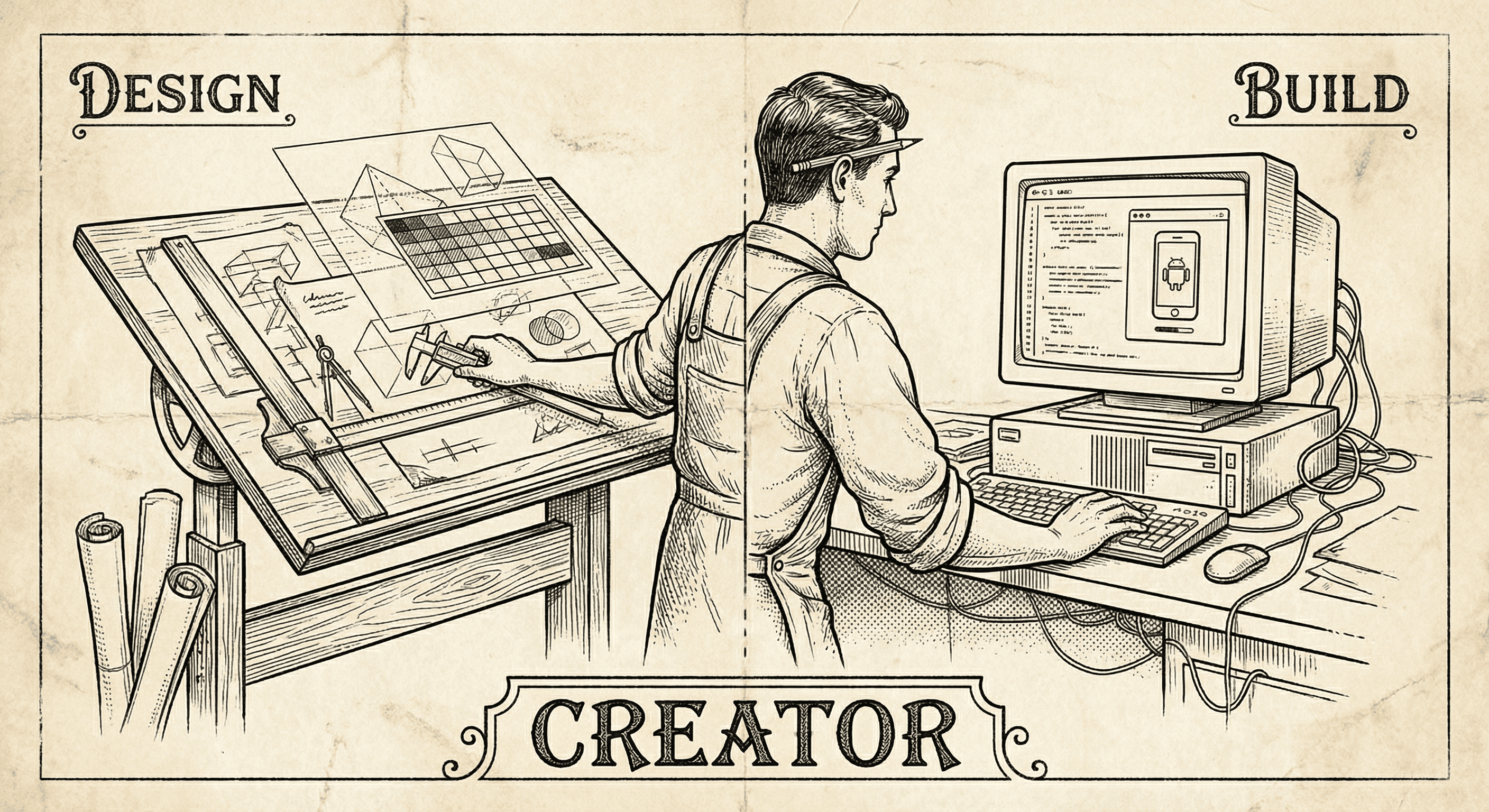
Designers have the taste, the empathy, and the vision. The missing piece is often the ability to ship. Here is why building — not just designing — is the next step, and how to start.
Practical, actionable advice for adding voice to your application the right way — from choosing the right moments to speak, to handling errors gracefully, to respecting your users' preferences.